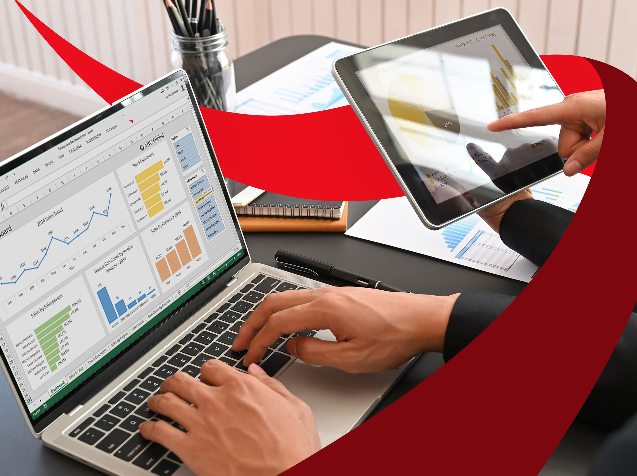
Creating Visual Dashboards in Microsoft Excel
No matter what business you’re in, data-driven dashboards are crucial for drilling down into the insights that matter most to your organization. Microsoft Excel dashboards provide a simple solution for providing access to current, high-level data in one central location and for tracking key performance indicators in real time.
Sign up for this LIVE, virtual course and you’ll learn how to create impressive visual dashboards using tables, charts, gauges, numbers and other interactive elements. You’ll discover how to insert slicers to filter data…how to add graphic enhancements like pictograms and word art…and how to share your interactive dashboards with others.
For an optimal experience with this course, we recommend Excel 2016 and later. Windows platform preferred.
Course Outcomes
- Provide high-level data to users in one central location
- Track key performance indicators in real time
- Design a dashboard from scratch
- Enhance a dashboard with graphic elements
- Use macros to make a dashboard interactive
Course Agenda

Request group training
Complete the form below to request tailored, private training for your team. We’ll be in touch to discuss your group’s specific goals.
More Courses in
Related Courses

skillpath.com/OXDASH |
Creating Visual Dashboards in Microsoft Excel
No matter what business you’re in, data-driven dashboards are crucial for drilling down into the insights that matter most to your organization. Microsoft Excel dashboards provide a simple solution for providing access to current, high-level data in one central location and for tracking key performance indicators in real time.
Sign up for this LIVE, virtual course and you’ll learn how to create impressive visual dashboards using tables, charts, gauges, numbers and other interactive elements. You’ll discover how to insert slicers to filter data…how to add graphic enhancements like pictograms and word art…and how to share your interactive dashboards with others.
For an optimal experience with this course, we recommend Excel 2016 and later. Windows platform preferred.
Session 1: Communicating Data Through Dashboards
- Explain how Excel dashboards are used to visually analyze key metrics
- Describe how Excel dashboards differ from standard worksheets
- Know how to determine what information needs to be communicated
- Plan a dashboard layout that visually displays large volumes of data
Session 2: Designing a Dashboard From Scratch
- Understand how to structure your raw data using tables
- Explain how to create a data staging area
- Describe how to add slicers to filter data in the dashboard
- Use form controls add interactivity
Session 3: Enhancing Your Dashboard
- Add pictograms, word art and other graphic elements to a dashboard
- Understand how to make a dashboard interactive using macros
- Arrange the dashboard and make final adjustments so it’s fully functional
- Share your interactive data with others